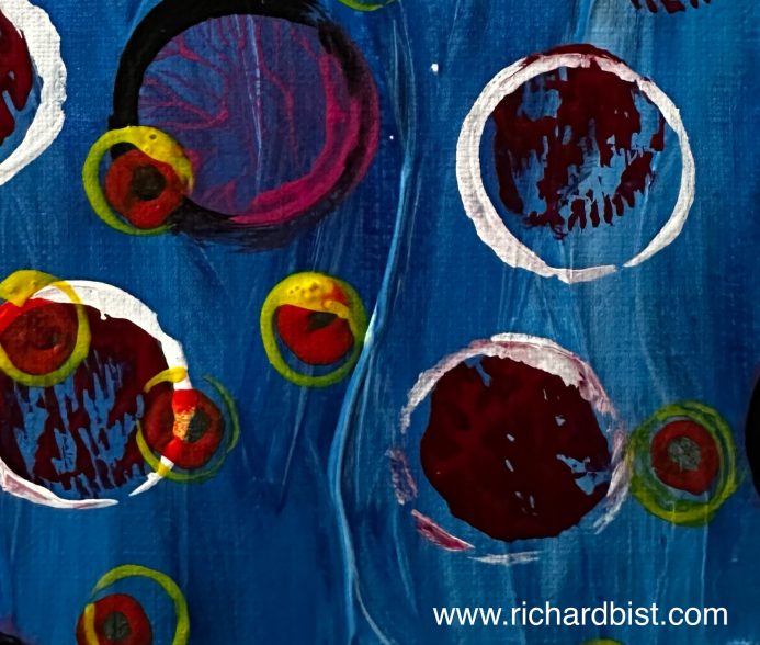
After my last practice series with abstract flowers, I wanted to do something different. Well, not completely different since the circles feel like they are carry overs from the flowers (similar shapes). Circles are benign shapes. No straight edges or pointy corners. Very fung shui.
I also felt like going in a more abstract direction and not doing anything immediately recognizable, but still visually appealing.
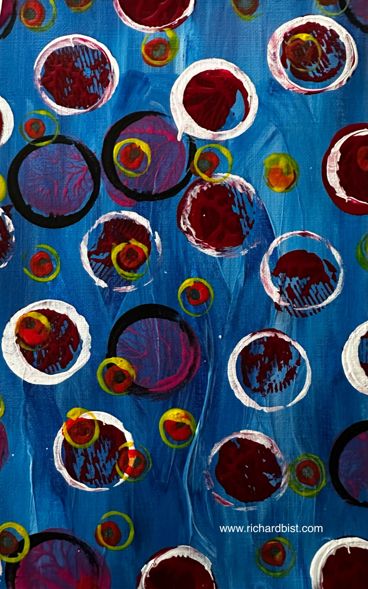
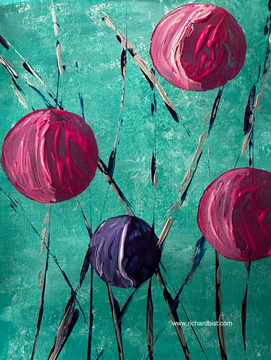
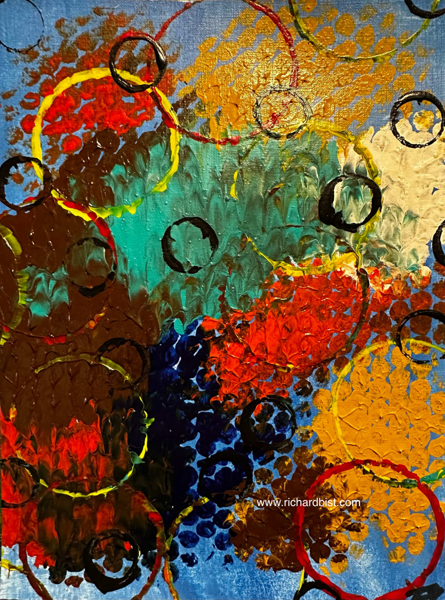
The pieces below were all done on 9 inch by 12 inch canvas paper. I used brushes, a palette knife, balled-up paper towels, cotton swabs, some bubble wrap, a few lids from jars and bottles, and my fingers, of course. Who doesn’t like to get a little messy when creating?
RB
Love all of them. Each one is different. No favorite out of this batch.
That’s wonderful, Pat. Thank you for giving them a look!
I like all three, but the third one has impact and focus. I like the splash of red.
I’m glad you see that in this canvas, Swabby. I try to add some sort of focal point to most of my paintings, and the red in this one did as intended.
The third one makes me think of looking at something colorful through a foggy/frosty glass. 💞💞💞
An interesting way to see it, Dawn. I used bubble wrap to create that layer (swabbing my colors onto a large piece, then pressing it against the canvas). It really does look like colors through glass, though!
That’s what I thought of immediately! That pic could make a fun photo prompt! 💞
If you feel inspired… 🙂
Thanks! 💞
The second one looks like something under a microscope!
But the third is my favorite. It reminds me of adventure. An alien forest.
I like your analysis, Michelle! I like that third one a lot, as well. The messiness appeals to me. 🙂
I love the first one best. 😄
Glad to hear that, Morag. I think that first painting “pops” the most with the bright colors.
Did you study art? Do you know Wassily Kandinsky’s art? These pieces remind me of some of his paintings, circles within a circle. Also has a lightness about it.
My major was creative writing, but I minored in humanities and I’ve always loved reading and studying painting. I’m incredibly flattered that I reminded you of Kandinsky. Many thanks!
You are welcome
I’m sorry I hope it didn’t seem like I was being inquisitive asking you if you studied art, I just didn’t know if you would have heard about Kandinsky.
It must have been really nice to major in creative writing. In another lifetime maybe I could do that😄
No apology necessary, Morag, and no offense taken! I’m flattered.
Thank you 🙏😊
Wow !!!
What brilliant usage of colours !!
Richard, your piece truly embraces the freedom of Abstract Expressionism.
“Every good painter paints what he is.” – Jackson Pollock and your paintings are vibrant , full of life🩵🌷
So very kind of you, Aparna! I’m glad you liked these! Thank you for commenting. 🙂
Pleasure was all mine.😊
For me the first painting wins🌟✨
So cool!
These paintings made me think of bubbles, chewing gum that is… blown into ball (or however to say that 🤭 hope you understand what I mean) and a blown, colorful dandelion (again, probably not the right way to say it 😅). And I love all of those!
But I feel most attracted to the first painting, probably due to the colors.
I only ever wear white and black, but I think people who like to wear colors, this would also make a great fabric pattern!
I understand exactly what you’re saying, Andrea. I see that, as well, and I’m glad you enjoyed these pieces.
Funny thing to note – I generally wear a lot of black and dark colors, as well. But my paintings tend to be brighter. Not sure why that is.